New office, new logo, new website
Good things take time, but after 15 years in an office at “Dannebergplatz” in the 3rd district, we finally managed to move into a new modern office on EUROPLAZA in June 2017. We found the perfect space for our projects and ideas on 450 m2. However, since the move also gave us the opportunity to change our external appearance and our homepage was getting a bit old, we decided to tackle all 3 things. But one after another.
“Dannebergplatz” – An IT company leaves the apartment
Granted, it wasn’t the first time we’d looked for a new office, but this time there was no other choice due to our ever-growing team. Despite the opening of a second location in Linz, the existing space in the attic apartment in the third district of Vienna had simply become too small for us and our expansion plans called for a professional office that was big enough to facilitate a growing IT company.
There was of course a certain sadness when we finally left the apartment in June 2017. Not so much the office space itself, but the surroundings, the “Arenbergpark” and the nearby “Landstrasse” and the possibility of walking into the city have kept us here for years. Since our office was in an attic apartment, we also had to cope with sloping ceilings and so had certain parts of the 200m2 office space that could only be used with caution (or rather with a retracted head). Despite everything, we had grown to love the office over the years and used the conference room intensively for our meetings.
Europlaza – a perfect office for an agile approach
After a short and exhausting search, we found the perfect office space for us at the “Europlaza” near the “Meidling” train station. Flooded with light, professional, and above all with a great coffee kitchen in the heart of the office, which we have expanded into a spacious social area (giving up a former “file room”). 2 open-plan offices provide enough space for our consulting / customer service team and our dev team and support the agile approach that we have been practicing consistently for over 3 years. A cozy dining area that offers space for the whole company and a foosball table complete the heart of our social area. 2 meeting rooms give us the opportunity to hold meetings with our customers or even internally and to discuss the important things in peace. Each workstation is equipped with 2 monitors and a headset. Docking stations for notebooks are standardized so that desk sharing is also possible.
New logo & new slogan
Our old blue logo with its bulky slogan “working solutions” was getting old and no longer said what we actually stand for. So, together with our graphic designer Aglaja Knapp, we were looking for a better slogan and a more modern logo.
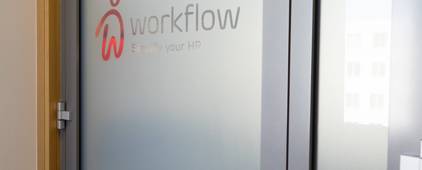
After a long search and many meetings, the slogan “Simplify your HR” finally became our new slogan to accompany our new logo, which is now red and has various curves and arcs. It was important to us to leave the “technical” image and to create an emotional response with our logo. The big “W” in the logo can also be interpreted as a “person”. The experience of the last few years in various projects that “less is often more” and the acceptance of the solution has a large part to do with how easy the software is to use for the end-user (i.e., the employee) has led us to this slogan.


